Volume Analysis | 10.8.21
Our goal in these market updates is to build a perspective of the current state of the markets. Let’s begin by first recalling our 2021 market outlook. In our January 2021 outlook edition, I stated:
“Many of you have asked me for my outlook for 2021. Due to the nature of capital flows, it can be challenging to provide that perspective. I am following the path another is blazing. However, I will go out on a bit of a limb and share my thoughts away from my primary perspective.
Envisioning 2021’s outlook calls to mind a market one decade ago, in 2011. In 2009, the Federal Reserve began quantitative easing. By 2011, we began a mild recovery in our economy. As the economy improved in 2011, the Fed began to question how much more stimulus was necessary, and their resulting policy was known as “Operation Twist.” What a perfectly appropriate name, because “Operation Twist” turned the market into a pretzel! ….
Like in 2011, as the economy reopens, the Federal Reserve may again question the necessity for the current amount of stimulus. Also similar to 2011, the good news of economic recovery may lead to disappointment should the market lose the tailwind presently generated by the Federal Reserve. 2011 was neither a bad market nor a good market…but it was sure was wild, fluctuating up and down like a yo-yo. I am not implementing market action on this 2011 analogy, only mentally preparing myself for the possibility.”
Now, not only are we seeing the aforementioned Federal Reserve policy similarities, but we’re again revising the potential “Fiscal Cliff”. The “Fiscal Cliff” occurred in 2011 when Standard & Poor’s downgraded the United States credit rating from AAA to AA due to a government shutdown that lasted 16 days. August 8, 2011 was referred to as Black Monday, but given today’s climate, we might better refer to it as Red Monday, as the DOW finished down 5.55% in the red. Overall, the S&P 500 lost 18% from its peak on July 7, 2011 in about a three month span.
Another similarity to 2011 is significant sovereign debt issues. We’re currently threatened by China’s Evergrande, which is weighing on global markets. In 2011, we had the collapse of MF Global, one of the biggest bankruptcies in history. So, could history be repeating itself? Let’s look at the data to assess the current state of the markets, starting with Chart One below.
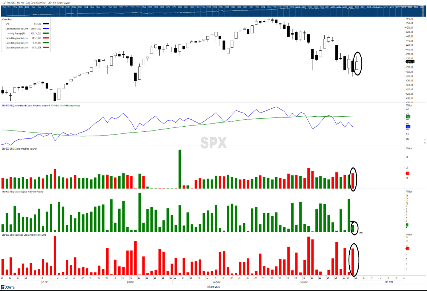
Chart One: S&P 500—Capital Weighted Daily Volume ending 10/05/2021
Source: OPTUMA www.optuma.com/volumeanalysis
Looking at the capital flow chart above, notice the second panel from the top is the trend of daily capital market flows. After testing support on the 10th and the 14th of September, capital monetary flows into the stock market broke its upward trend on September 17th. When this happens, what we would like to see in a bull market is a quick rally back. This happened, but then the market immediately failed again. Historically, this is not a good sign. We have traded under trend ever since.
Now let’s look at the circles, highlighting October 5th. Notice the market rallied strongly back on the 5th, eclipsing the previous day’s high and making a higher low. This is bullish price action. However, notice in the capital flows panels below the price chart that capital weighted volume tells a different story. Looking at the bottom panel, the capital weighted downside volume is in red; in other words, the money flowing out of the S&P 500. This is spiking, while the upside capital flows noted in the panel above it in green is relatively minuscule. This explains the red bar in the middle panel above, where total capital volume is red (signifying more capital outflows than inflows).
So even though the market was strongly up on the day, 75% of the volume flow was to the downside. Next, let us look at the market internals in Chart Two below, labeled Weekly Market Breadth.
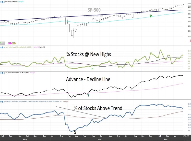
Chart Two: Weekly Market Breadth
Source: StockFinder, Worden Brothers
The panel second from the top, titled “# Stocks @ New Highs,” is the number of stocks at new highs. New highs indicate how much resistance is overhead. The higher the number of issues making new highs, the easier it may be for the market to advance higher. We pointed out in our March edition that this indicator is typically our fastest, meaning it gives the earliest warning signals. Notice that the number of stocks making new highs peaked in February and has been in a steady downtrend ever since. Now we find ourselves potentially nearing a bottom as less than 5% of issues are currently nearing 52-week highs.
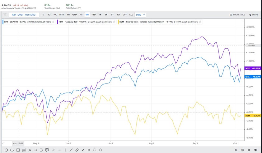
Moving down one panel to the panel labeled Advance Decline Line, we come to our most significant potential development. Measuring how many stocks are up versus down, the Advance Decline line is a picture of market liquidity. Due to their size and scale, when large institutional investors decide to reduce their long-term risk exposure. Large Institutions can’t just hit the sell button without significant ramifications. This is because their own operations may drive down their positions and the market itself. To avoid this negative impact, they will stage their selling programs over time, sometimes months in the making. The first to go are typically the least liquid issues. Generally, these are the small & mid cap stocks. Notice, in Chart Three below, the relative underperformance of small caps (yellow) versus the Nasdaq 100 (purple) and the S&P 500 (blue). Over the past six months beginning April 1, 2021 through October 5, 2021, small caps, as represented by the Russell 2000, are down around 1% while the S&P 500 is up over 8% and the Nasdaq 100 is up over 10%.
Chart Three: Large -VS- Small April 1st -Oct 5th, 2021.
Source: Today’s Markets Koyfin
You can see above the impact that small and midcap stocks are having upon the Advance Decline line, which is now weakening much more than the broader S&P 500 price index. Also, note that the Advance Decline Line was one of our first indicators, along with Capital Weighted Volume, to break out above trend ahead of the S&P 500 as noted in our May 9th 2020 publication of Volume Analysis “Breaking Resistance Part 1”. Should the Advance Decline Line break below trend, it may be a warning sign the market may follow.
Advance Decline trend breakdowns do not always lead to S&P 500 trend breakdowns. However, going back over 70 years, there have only been very few S&P 500 major trend breaks without the Advance Decline giving prior notice.
Now let’s move to the very bottom panel of Chart Two labeled % Of Stocks Above Trend. The % Of Stocks Above Trend tells us how many stocks are trading above their long-term trendlines. The number of stocks at new highs indicates overhead resistance, whereas the Advance Decline Line measures liquidity. The % Of Stocks Above Trend indicator is a momentum measure of both liquidity and resistance attributes. The % Of Stocks Above Trend also peaked in February and has been steadily declining since then. Now less than half, 45%, of listed US stocks are trading above their long-term moving average trend lines (50-week moving average). This finishes up our discussion on market breadth. Let’s move on to capital market flows.
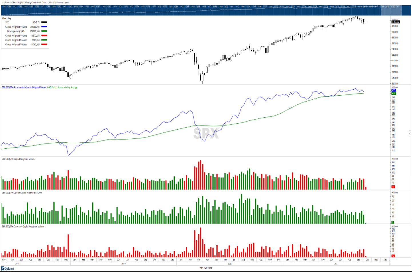
Chart Four: Capital Weighted Dollar Volume Flows
Source: Optuma www.optuma.com/volumeanalysis
Chart Four above is weekly capital weighted dollar volume. Capital weighted dollar volume tracks all the money coming into a market index (capital weighted up-volume green bars) and flowing out of a market (capital weighted downside-volume red bars). In this case, our market is the S&P 500. In my world of volume analysis, a bull market is defined by capital flows being above its long trend, and a bear market is capital flows trading below its long-term trend. A bull market dies when capital money flows fall below trend and is reborn again when it breaks above trend. Inversely, bear markets begin when capital flow trends turn negative and are destroyed when they break above trend once again.
In the second panel in Chart Four, the blue line representing the long-term accumulation of capital flows has been flattening and is now weakening. Currently, capital dollar flows (blue line) remain slightly above their long-term trend (green line). This suggests the S&P 500 remains in a bull market phase with capital flows waning towards a critical trend junction.
Next, let’s look at capital weighted volume as opposed to capital dollar volume above.
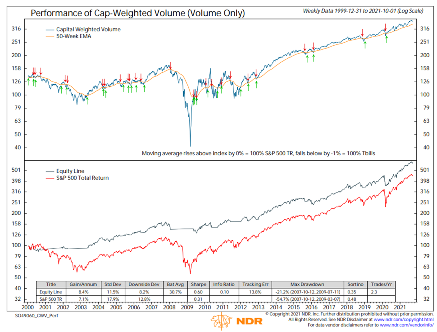
Chart Five: Capital Weighted Volume Only
Source: Ned Davis Research
Our final chart plots capital weighted volume. It differs from capital weighted dollar volume as it eliminates price’s impact upon the capital flows computation. This is important and can be leading market data. Institutions wisely manipulate their purchasing and selling measures to reduce the impact of their own operations upon price. For a time, these actions may conceal that there are large buyers or sellers of a given security. To hide their buying operations, large institutions will often buy at the bid, preventing the price from being bidded up. Likewise, they will often sell at the ask to conceal selling operations, preventing the price from being forced lower. Now, depending on liquidity, these actions only work for so long before the supply/demand imbalance is actualized. Although we cannot see the visible impact of these activities directly upon price, their tracks or volume of sales (or purchases) cannot be hidden.
Now let us return to the earlier scenario where an institution wants to work out of the market. Again, an institution desires the least amount of impact on price while drawing the least amount of attention, preventing others from front running their trading programs. Once illiquid issues have been sold, as evidenced by the falling Advance Decline Line, large institutional investors will then focus on liquidating the most liquid and well-capitalized positions. Although we may not notice a strong impact on price, their tracks are revealed through capital weighted volume. Before major market downturns, you may see large spikes in downside capital weighted volume. With that in mind, observing Chart Five above, notice the capital weighted volume (blue line) remains healthily above its trend (the orange line). This suggests the liquidity squeeze has not yet presented itself, a bullish indication.
Overall, market breadth is weakening, suggesting caution for the market. Two of our most powerful leading indicators, the Advance Decline Line and Capital Dollar Weighted Volume are nearing support. A break in the Capital Dollar Weighted Volume trend may represent an inflection point to either consider de-risking one’s portfolio or, for those with heavy cash, to step or tiptoe into the market while we are near support. Be mindful the market’s price trend and capital weighted volume have weakened but remain above trend. The S&P 500 is still in the bull market phase with trendline support @ 4275 and long-term moving average support @ 4075.
Wishing you the very best!
DISCLOSURES
Kingsview Wealth Management (“KWM”) is an investment adviser registered with the Securities and Exchange Commission (“SEC”). Registration does not constitute an endorsement of the firm by the SEC nor does it indicate that KWM has attained a particular level of skill or ability. Kingsview Investment Management (“KIM”) is the internal portfolio management group of KWM. KIM asset management services are offered to KWM clients through KWM IARs. KIM asset management services are also offered to non KWM clients and unaffiliated advisors through model leases, solicitor agreements and model trading agreements. KWM clients utilizing asset management services provided by KIM will incur charges in addition to the KWM advisory fee.
Information presented is for informational purposes only and does not intend to make an offer or solicitation for the sale or purchase of any specific securities, investments, or investment strategies. It is not, and should not, be regarded as investment advice or as a recommendation regarding any particular security or course of action. Opinions expressed herein are current opinions as of the date appearing in this material only. This information does not address individual situations and should not be construed or viewed as any typed of individual or group recommendation. Be sure to first consult with a qualified financial adviser, tax professional, and/or legal counsel before implementing any securities, investments, or investment strategies discussed.
Past performance is no guarantee of future results. There are risks associated with any investment strategy, including the possible loss of principal. There is no guarantee that any investment strategy will achieve its objectives.
